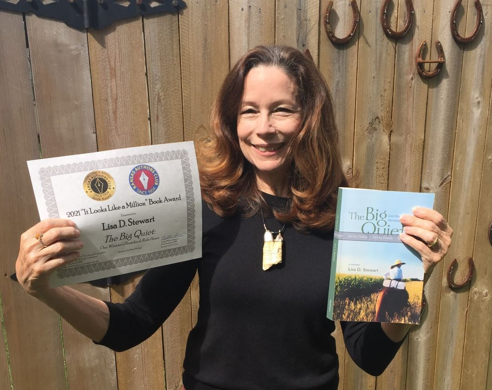
The Big Quiet: One Woman's Horseback Ride Home
By Lisa D. Stewart
Interior Design: Lisa Stewart, Robert Stewart, & Meadowlark Press.

Excellent choice of imagery and typography that directly ties into the narrative of the story. You almost can literally “judge the book by the cover,” with the attractive, evocative photograph on the front, and the effective use of the blurbs and the brief summary about the author and her intention on the back. The colors effectively promoted a story told close to the land, with the use of sky blue and earthy green. The subject of the cover photo obviously represented the author and it showed her doing exactly what the book is about—a memoir of a journey of discovery while riding a horse in the countryside. Professionally printed and bound, the cover presents an attractive premise to the reader, welcoming one to open the book and begin the author’s trip alongside her.
Cohesion of Cover and Interior Pages A
The interior pages related to the cover design by use of the display font featuring a hand-honed, slightly distressed but easy to read font. The cover design is somewhat minimal, with a big empty sky at the top, and the chapter openings echo that feeling throughout.
General Format A-
Everything followed the standards set out by IBPA. All pages were in the correct order and the suggested elements were included. I was a bit puzzled by the use of the little pointer…I believe it alluded to the quote by Issa, with a radish as a pointer, but if I have any criticism of the book, it presented more of a “break” than was required by the narrative. It wasn’t used enough throughout to be an effective design element and seemed somewhat distracting.
Typography A
The use of an elegant typeface for the body text, perfectly leaded, and the attractive wide margins make the book appear to be an “easy read.” Clean white space at the beginning of the chapter, and the choice to make all chapters appear on the right side present a welcome break for the reader’s eyes. Professional composition of the text, with minimal hyphenation and awkward line breaks.
Printing and Binding A
Printing was well-done, with colors appearing bright but earthy. Soft, matte finish to the cover adds to the more rustic feel of the book. Off-white, non-glossy pages are welcoming and facilitate long sessions of reading.

Desiree Ultican loves art, history and mysterious circumstances. She is a graphic designer by trade, a collector of vintage paper ephemera by inclination and an author by desire and determination after publishing her first book in 2010—the steampunk novel The Empress of the Clouds. Over her 40+ years as a graphic designer (as Desiree Mueller), she designed the interior pages for several books for Andrews McMeel Universal and The Vintage Workshop, both based in the Kansas City area. While working for various advertising agencies and design firms in town, she designed books for corporate and municipal clients. She currently is the art director for Lamcraft Inc., a supplier of laminated bookmarks and products for the funeral home industry and for museums nationwide, including the U.S. Capitol and the National World War I Museum in Kansas City. Desiree keeps company with her husband, Jim, and their cats in Independence, Missouri.


 RSS Feed